Monday, December 29, 2008

Family Matters: The Fantastic Four's Triumphs and Tribulations, part 1

Sue Reed Wedding-Annual 3

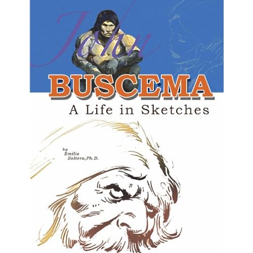
Part One – The Wedding of Reed and Sue

Fantastic Four Annual #3, 1965

“Bedlam at the Baxter Building!”
Stan Lee, Jack Kirby, and Vince Colletta

Doug: The story begins with a raging Doctor Doom at home in Latveria, railing about revenge against Reed Richards, the only man to defeat him. As a means of in turn humiliating Reed on his wedding day, the good Doctor seeks to bring forth an army of do-badders to bring terror and turmoil to the nuptials. Doom reaches for his “Emotion Charger” and begins to kindle hatred in already black hearts. This was not a weapon that we’d seen prior, nor do I think it’s been used since – am I wrong?

Karen: I think this was the first and last time it appeared. Regarding the plot though, if I recall correctly, I believe it was mentioned in the Ronin Ro book, Tales to Astonish, that Kirby intended for Doom’s ranting to be directed towards the Thing, and not Richards. The Thing had crushed Doom’s hands in issue 40 (not long before this annual), and if you look at those drawings, the way Doom is holding his hands up, he seems in pain, so that seems to verify it to some degree. However, it does seem like Stan took the more logical route, that Doom would be out to ruin Richards’ wedding, because he hates Richards.
Doug: Right away I noticed Colletta’s clean line over Kirby’s pencils, in spite of the fact that most panels have backgrounds! This issue had a very similar look to the Thor books those two collaborated on – it’s still Kirby action, but somewhat softer, as opposed to Joe Sinnott’s more vibrant embellishing.

Karen: While I find Colletta’s inking agreeable on Thor, I’d much prefer to see Sinnott’s smooth lines here. But still, the issue overall looks really nice.

Sharon: I really like Colletta's inks here, but this issue is kind of the last we see of the "old school” FF; after this, the book adopted a new look and really took off. With the very next issue in continuity- - #44- - Joe Sinnott starts his run as the regular inker and the book's look immediately moves from old-fashioned and soft focus (as here) to high tech and modern; it even becomes futuristic. The stories themselves reflect this change as well, becoming more and more cosmic as the FF embark on what many consider their greatest run--the Inhumans, the Silver Surfer, the Black Panther. Now, I think this progression would have occurred if Colletta or Chic Stone or whomever was the inker--obviously Jack was the mastermind of all the new characters and plots; and he had introduced Medusa months earlier in #36--but the Kirby-Sinnott pairing was certainly a matter of right place, right time; and it served as a very clear, distinct visual earmark of the new direction.

Doug: Stan’s dialoguing is pretty standard fare from this time period. Really, you could pick up a DC from 1965 and not find a lot of difference. The heroes still speak with bravado and in clichés. The women still seem dumb – “Reed, what does it mean?” “We’re under attack by some powerful unknown foe, darling!” Well, duh! What was your first clue??

Karen: It was 1965, so the women (where was the Scarlet Witch, or the Wasp?) were pretty useless. Marvel Girl contributes, but when the big fight occurs, Sue is back at the Baxter Building, no more useful than Alicia. As for the dialogue, I’m certainly no DC expert, but I think the Marvel folks always spoke with a little more panache.

Sharon: Really ridiculous that Sue is relegated to staying with Alicia. Thank goodness Sue would finally begin to show some backbone in the early 1970s!

Karen: I still wish she’d left Reed for Namor…but more on that in our later reviews!

Doug: Kirby really did a Perez-like job, cramming so many characters into one story. To list:

The Fantastic Four, Dr. Doom, Tony Stark, Patsy Walker and Hedy Wolfe,Puppet Master, Nick Fury and SHIELD, Red Ghost and his Super Apes, Professor X, Mole Man and the Subterraneans, The X-Men, Dr. Strange, The Mandarin, The Black Knight, Kang the Conqueror, The Mad Thinker’s Awesome Android, The Grey Gargoyle, Thor, The Super Skrull, Matt Murdock, Karen Page, and Foggy Nelson, Daredevil, Hydra, Iron Man, Captain America, Quicksilver, The Cobra, The Executioner, The Enchantress, Mr. Hyde, Hawkeye, Spider-Man, Electro, The Unicorn, The Melter, The Beetle, The Eel, The Mad Thinker, The Human Top, Attuma and his Atlantean army, The Watcher, Stan Lee and Jack Kirby.

NOTE: The cover contains even more characters that are not in the story, including the Sub-Mariner, Kid Colt, the Hulk, Sgt. Fury, the Wasp, Medusa, the Leader, the Red Skull, Loki, the Scarlet Witch, and the Wizard.

Sharon: Quite a list. The cover is magnificent, even if some characters did not appear in the story (as you noted, Doug). It's a cover that has been paid homage to many times; one such famous instance is Byrne's cover to FF # 236.

Sharon: Also, this issue would have been contemporaneous with Avengers #21, so this could be said to be the first time since Avengers #16 the old Avengers (at least, Thor and Iron Man) appeared with the new Avengers (even if Wanda was conspicuously MIA in the story, you have to assume she was there with the rest of the Kooky Quartet…in the Marvels version of this event, she’s actually shown at the wedding).

Doug: Yes, and this could be a slight continuity gaffe, as I recall that it was a big deal in Avengers Annual #1 when Thor and Iron Man returned – seemed at the time that none of the newbies had been with the veterans since Avengers #16.

Sharon: Here, Quicksilver says he's heard of the Human Top and promptly bests him with a single punch. But a few years later (Avengers #46) Pietro acts as if he'd never met the Human Top before (now known as Whirlwind, but still sporting the same costume as he did in FF Annual #3).

Doug: Do you suppose Roy Thomas hadn’t read FF Annual #3? Surely he had… Of course, with Roy always telling us how faulty his memory is, perhaps this has been an ongoing problem for him!

Karen: I first read this book as a small kid, in reprint form, and the sheer number of guest stars was over-whelming (and exciting)! The reader really got a sense of a thriving, interconnected universe. I really got a kick out of Stan and Jack’s cameo. Just another reason Marvel was always so much fun.

Sharon: It was always a treat to see Stan and Jack in a story!

Doug: I have one minor coloring complaint – I used the FF DVD-ROM as my resource, which contains scans of over 500 comics. So I’m assuming that the copy I read was indicative of an entire print run back in 1965. My complaint is the coloring on Kang’s outfit. Where it should be purple and green, it is instead orange, blue, and purple.

Karen: I used the DVD too, and heck, on the final page, Gabe Jones is purple!

Doug: Overall, this book is everything that Annuals were meant to be – a plain old FUN story, lots of good guys and bad guys beating each other’s brains in, and a happy ending. The book also contained three reprints from early in the FF’s career.

Karen: All in all, I agree with Doug: a very enjoyable, action-packed romp! I liked the sub-plot with the blind Daredevil driving the truck loaded with the explosive to the Hudson River – only to accidentally (and fortuitously) drop it right on top of Attuma and his army! We also get one of Kirby’s photo collages (could this be his first one?) when Reed travels with the Watcher.

Sharon: Kirby had been using photo collages here and there for about a year or so prior to this issue, most famously on the cover of FF #33. From what I’ve read he was enamored of this technique, though I must confess this reader didn't like it--I wanted to see his art, not photographs! And I am in good company; I’ve read Joe Sinnott felt the same way about Kirby. But who am I to begrudge the King the right to experiment with new techniques.

Doug: I can take or leave the Kirby collages. I recall the first time I saw one, in the pages of a Marvel’s Greatest Comics, that I thought it was a little odd, yet powerful at the same time. I think they work for scenes like “universe travel” or the Negative Zone. Kind of gimmicky and probably shouldn’t have been overused.

Karen: It’s fun to look at his collages and identify individual photos; I was reading through the Jack Kirby’s Fourth World Omnibus, vol.1, and noticed a lot of strange stuff in the numerous photo collages: bottles on a conveyor belt, skulls, the soles of shoes, buddhas, karyotypes, circuit boards…everything but the kitchen sink. All very trippy.

Doug: Now, some specific thoughts on the plot – Stan seemed to borrow from this story about a year later, in regard to the scene where the Watcher takes Reed away and gives him a device that will undo the damage that Doom had wrought. The Watcher will repeat this with Johnny in the glorious Galactus trilogy only a year after this story.

Sharon: Actually the Galactus trilogy was closer to four-six months later, that is if we go by issue release dates. This Annual was issued around the same time as FF #44 and a mere four months later Stan and Jack produced the Galactus trilogy, which started in FF #48 (concluding in #50).

Karen: I hadn’t thought about that before, but it’s true. The Watcher saved their bacon at least twice, if not more often. I think eventually he was put on trial by his fellow Watchers in the late 70s, in Captain Marvel, not long after Starlin left.

Doug: As for the wedding – of course it comes off, and quite nicely.

Sharon: Yes, but will someone please explain to me how, in the scene where Sue and Reed are actually pronounced man and wife, Professor X appears to be --standing? Sure, Sharon, there’s a simple explanation: would you believe the Professor’s supporting himself by his mental powers, with Jean throwing in some telekinetic help? Or that Dr. Strange is levitating him? Or that he is standing by means of less mystical methods, such as crutches?
Doug: Poor Charles probably had no choice but to stand – these were the days before the ADA!!

Doug: This story has all of the elements of a Silver Age Marvel: colorful characters, characterization done right so that readers new to any of the characters in the book might feel comfortable in giving another magazine a try-out, and an ending where good triumphs over evil with no body count left in the wake. Unfortunately, there isn’t a reveal on what Doom thought when his plan was undone – in fact, Reed never does figure out (or at least he doesn’t let on that he has) that Doom was behind it all.

Karen: Whoa, partner, Reed’s thought balloons on the next-to-last page show that he has concluded Doom was behind it all! Maybe he used the sub-atronic time displacer on you, so you forgot you read that page!

Doug: Gah!! On the fourth look, I see it as plain as the nose on Ben Grimm! Man, I looked at that panel with Hawkeye in it three times (3x!!!) and did not read the balloon, skipping to the panel at the top of the next page. Like you’ve said before, Karen, all of these words – just not used to it in comparison to today’s mags!

Saturday, December 20, 2008

Thoughts on Jack Kirby and "Tales to Astonish" by Ronin Ro


Karen: Recently, Doug and I read a book called “Tales to Astonish – Jack Kirby, Stan Lee, and the American Comic Book Revolution” by Ronin Ro. Sharon had read the book long ago and was the one to encourage us to read it. It chronicles Kirby’s life and also looks at the comic book industry over the years, with a fair chunk of time spent examining the early years of Marvel Comics. Now that we’ve all read it, we’ve decided to do a group review and discussion.


Doug: Many thanks to Sharon, and to the close-out bookseller from whom I bought this tome! It was a steal at $5!! What an interesting resource to have in my library.

Sharon: I had a suspicion you both would be interested in reading this…I’m so glad you picked it up! Since I’ve waxed poetic many times about the subject of Kirby and Marvel for the past couple of years on the Avengers Assembled boards, it’s exciting to see the two of you avail yourselves of the information in Ro’s book. His book provides a readable, basic introduction to that era.

Karen: While I had known some basic history in this area, this book really filled in a lot of details. There are quotes from many comics professionals and a lot of ‘behind the scenes’ stories. It’s a fun, quick read, despite some rather pedestrian writing by “Ronin Ro” (what a goofy pseudonym). My biggest complaint about the book itself is the lack of any annotation – no footnotes or even simple attribution of quotes in the text itself. There’s also no bibliography or index! From what I gather, many of the quotes in the book have been found in other sources. So it may be that the book is a hodge podge of previous works, all lumped together here.

Sharon: The lack of “academic annotation” is maddening, but he does list the names of people whom he says he consulted for the book…plus there’s a great list of source material, items no self-respecting comic historian or even plain ol’ fan should be without!

Doug: I have to tell you that as a history teacher and reader of many research-based books that I was academically offended by this book. Hear me: it’s an interesting read, a serious grabber! But I simply could not believe that any author would think it satisfactory to make such claims as were made, to offer quotes from particular people – some matter-of-fact, some to be honest quite damning toward other players – and never cite the source of the information. I’m serious – if Ro was a student in one of my college-bound classes and turned in a paper like this he would fail solely on his lack of referencing.

Doug: Saying that, I suppose I (we, if I can speak for my colleagues) am guilty of throwing my two cents into these discussions each week without directly citing sources for information that might not be common knowledge to our average reader. However, you the reader have the ability to leave me (us) a comment – I certainly feel I would owe an inquisitor the courtesy of revealing any source material I use in making these wonderful posits!

Doug: I especially liked that Ro began the story in the Golden Age, an era of comics history that I know too little about. One of the interesting facts about the Golden Age that continues to stand out for me is the proliferation of Jewish creators working in the industry: Stan Lee, Jack Kirby, Jerry Siegel, Joe Shuster, Will Eisner, Gil Kane, and on and on. As a history teacher who focuses on Holocaust study, I just find this an interesting legacy – that these men have given me one of the loves of my life.

Karen: The focus is on Jack Kirby, and he appears to be a somewhat tragic (almost pathetic) figure. It’s clear that Kirby never felt like he got the recognition he deserved. Certainly one could argue this was true. It’s clear today that both he and Stan Lee – and not Lee alone – were responsible for the creation of the Marvel Universe, and that Kirby was far more involved in plotting stories than originally thought.

Karen: It does seem like Lee got most of the glory in the past, but in recent years he seems to be more willing to share credit for the characters with the artists. But back in the late 60’s, seeing Lee get so much attention obviously drove Kirby to prove he could stand on his own, and he left Marvel for DC, where he thought he’d have a chance to create his own universe with the New Gods. But I think his obsession with being successful on his own probably made it impossible for him to ever really succeed again.

Doug: Several weeks ago when we did the 1st Appearance post about the Incredible Hulk, I cited Origins of Marvel Comics as my source for the material. In that book, each origin story was introduced by Stan relating the formative conversations/presentations of these iconic Marvel characters. As Ro points out in this text (over and over), Stan was quick to take credit for just about every idea that became a cornerstone of the Marvel Universe. In fact, Jack is said to have been thoroughly disgusted at Stan’s boldness in allowing only his name to appear on the cover of all of the Origins series books. As Karen said, it was just another thorn in Jack’s side, another source of hurt feelings and long-festering animosity.

Karen: When I first started reading comics, Kirby was already at DC. From reading reprint titles like Marvel’s Greatest Comics, I knew who he was and that he was the artist behind all the great Marvel heroes. But I guess I didn’t feel any special reverence for him. In fact, when he returned to Marvel in the 70’s, I found myself unimpressed with most of his work. The primary reason was that his writing was terrible. There, I’ve said it. I know some Kirby fans love everything he did, but his writing was excruciating. I still feel annoyed when I think of his “Mad Bomb” story in Captain America. It was obvious to me, even at a young age, what Lee had brought to their collaborations.

Doug: I, too, came to know Kirby in the pages of Marvel’s Greatest Comics. At the time, Rich Buckler, then George Perez, was penciling the Fantastic Four. While there was no doubt that Kirby’s books were full of fast-paced action in the mighty Marvel manner, I didn’t think his rendering fit in with what I was then-accustomed to: Buckler, Perez, Sal Buscema, John Buscema (who interestingly enough, would have been down my list at this time), Ross Andru, Jim Aparo, Joe Staton, and Dave Cockrum. Kirby’s fingers were square (a point made in Ro’s book, specifically in discussion about Kirby near the end of his career), his facial expressions sometimes extreme. A few years later, when (as you say, Karen) Kirby was given Captain America, his style was so dramatically different that I could hardly stand it. I bought the Marvel Treasury Special Captain America’s Bicentennial Battles, but didn’t appreciate it. Now, many years removed, I can say that I have an appreciation for this material, and truly treasure it as representative of the twilight of the King’s career.

Karen: Despite my dislike of his writing, I feel badly for how Kirby was treated when he returned to Marvel. It seems like many of the younger staff had no respect for him, which is ludicrous when you consider he built the universe they were playing in. Granted, the man needed a good scripter to work with, but the kind of petty acts that occurred during his second tenure at Marvel are inexcusable. And of course, on top of all that was the problem with getting his original art returned, which became huge and the over-riding cause in Kirby’s later years.

Doug: As Sharon so aptly paid homage to men like Neal Adams (in our earlier series of X-Men discussions) for their work in obtaining creator rights/benefits, it is a shame that Kirby’s pages were stolen from Marvel and ultimately from him. Anyone who peruses the original art section on Ebay knows that it is difficult to find any Kirby page that sells for less than $800. Literally, he was deprived of a treasure worthy of a King’s ransom (how’s that for a pun??).

Karen: One of the most shocking things to me was that artists would steal other artists’ original art and sell it! Both John Verpoorten and Gil Kane are mentioned as having done this. How low can you get?

Doug: Yes… “snake” was a term that leapt to mind.

Karen: Despite adversity, Kirby was incredibly productive. It’s mind-blowing, especially in the context of today’s artists, that Kirby would produce 15 pages of artwork a week! I imagine most pros today don’t produce 15 pages in a month. Besides that, he was also designing characters all the time, and in the early days of Marvel, he was laying out a lot of the issues, and doing covers! When he finally got his original art back from Marvel, it’s shocking to think that the 2100 pages he did get back were only a small fraction of what he produced over the years.

Doug: Karen, your guess of 15 pages a month is not far off. As you know, a standard comic these days is 20 pages (although with the recent habit of making the former page one splash a recap page, new art drops to 19 pages), which comes out to five pages a week. And given how many books today have a tough time staying on any kind of regular shipping schedule, you are right that today’s pencillers can’t seem to get it done at even what would have been a snail’s pace for Kirby.

Karen: I’m left with mixed feelings after reading this book. While it’s interesting to learn about what was going on in the comics industry, it does shatter the illusion of the ‘happy’ Marvel bullpen. All those Marvel Bullpen Bulletin pages gave me the impression that Marvel was a wacky, fun place to work. But the more I read about what was going on, the more disabused I become of that notion. I’m sure there were good times but, like any workplace, it had its share of problems. I guess despite all this, I still find I can enjoy the stories from that era, even if I know better now about what was really going on behind the scenes.

Doug: I wonder if it was Stan who wrote the copy for the entire Bulletins pages. They certainly read with that Stan Lee bombasticism that we all knew and loved – but I doubt that, given all of his other responsibilities, he had the time to churn out that propaganda each month.

Sharon: According to Danny Fingeroth in Write Now! #18: yes, Stan wrote all the copy, at least up through 1972. For more details, see the great article by David Kasakove, "Finding Marvel's Voice: An Appreciation of Stan Lee's Bullpen Bulletins and Soapboxes.” I’d mentioned this article on the AA! boards not too long ago and it’s a fantastic read.

Friday, December 12, 2008

It's on My Shelf -- Maybe It Should Be on Yours!!

Consider this the first in an ongoing series of book reviews spotlighting various comics histories. We’ll look at books about particular artists, companies, eras, etc. Sometimes each of your three hosts will fly solo – at other times we may chime in on another’s review (just because we can’t keep quiet about our love of this literary genre!). So buckle in, and maybe even start scaring up some loose change!


For the kick-off I thought we’d examine one of my favorite subjects: the life and work of Big John Buscema! A recent release paying homage to the master is Dr. Emilio Soltero’s John Buscema: A Life in Sketches (Pearl Press 2008; msrp $24.95). I purchased this tome just a few weeks ago at one of my local comic shop haunts.


I’ll have to say up front – it is difficult for me to give any sort of review of this book without comparing it to two previous biographies of Buscema: J. David Spurlock’s John Buscema Sketchbook (Vanguard Productions 2001; msrp for the signed/numbered hardcover $39.95) and the out-of-print The Art of John Buscema by Sal Quartuccio and Bob Keenan (Sal Q. Productions 1978).


Perhaps it’s because both Quartuccio and Spurlock included lengthy interviews with Big John, and there is additional material from and about Buscema in many of TwoMorrows Publishing’s various magazines (Comic Book Artist, Alter Ego, Back Issue, et al.), that I just find Dr. Soltero’s lack of text to leave his labor of love looking more like unfinished potential. Don’t get me wrong – despite what I thought was a bit of a hefty price tag, I am still happy to have purchased this book. It’s an extensive collection of John’s sketches (many from the backs of comic pages he was penciling as a hired assignment) and roughs that fits in the palms of my hands. But I have a confession to make – I’ve been pilfering scans of John’s artworks from Ebay dealers and other websites for years. I’ve amassed quite a digital collection of pencil/inks, roughs, covers, and finished pages – perhaps over 500 images. Soltero’s work (with no recently-discovered interview material) just wasn’t much different (nor compelling) from what I already own.

Soltero does include snippets of interviews with Sal Buscema, Neal Adams, Ernie Chan, Kevin Nowlan, Juan Gimenez, and even a comic convention panel featuring John Buscema responding to questions from Jim Shooter. But these are generally short in length, and don’t necessarily illuminate the accompanying illustrations. And while no one could argue the importance of Sal Buscema or Chan (or the authority of Adams), where are others who were John’s contemporaries – creators like Stan Lee, John Romita, Roy Thomas, Marie Severin, George Roussos, Tom Palmer, or Dan Adkins? Even researching and securing permission for use of existing interviews/tributes would have added to this book.

Spurlock’s book benefits from organizing Buscema’s sketches into chapters such as Warriors, Women, etc. Quartuccio’s interview covers many aspects of John’s career and really deals with then-contemporary work such as John’s assignment to Marvel’s Wizard of Oz adaptation and the How to Draw Comics the Marvel Way book. John’s art serves simply as examples of his prowess but does help to move the interview along. While Soltero certainly has no dearth of any type of Buscema’s work, it’s displayed pell-mell throughout the book with no real flow to it. Also of note is the frequent inclusion of rough panels and pages from the Conan story, Isle of Pirates Doom. This is a nice touch, but begins to wear on the reader after awhile – could the author not have secured similar panel/page samples from Buscema’s Fantastic Four or Avengers work, either of which there is a treasure trove of material?

But if you are a true fan who enjoys John’s renditions of major Marvel characters (and even a JLA rough to boot!), his Tarzan and Conan work, animals, women, and just generally mean-looking barbarians, wizards, and guys in suits, then this book should find it’s way to your library. I know I’ve come across as overtly negative toward my recent purchase. Please understand – there are few bigger Buscema fans than me. But because of that, I want more, more, and more about Big John. Where’s that long lost interview, that colleague who after all these years decided to tell a few new anecdotes? Perhaps that wasn’t at all Soltero’s intent with this book. He does, after all, remark in his introduction that in his opinion the Quartuccio and Spurlock books fell short in including the vast amount of sketchwork that he has been able to give the reader. So I guess it depends on what you’re after – if it’s a vast display of John’s beautiful renderings, then this book is for you. If it’s a lesser amount of drafting but with information about the man and his career, then I’d urge you to seek out the Spurlock book from Vanguard.

Sharon: I'll chime in here...I have the Spurlock book and as Doug says, it's quite informative about Big John's career and techniques and contains a great interview with John. Its only flaw, to my mind, is that it does not contain repros of his penciled costumed superheroes work in it; there's no Avengers, or the Surfer, or Namor, or... well, you get the idea. But it's a handy overall guide to Buscema and contains beautiful illustrations of non-superheroes. Okay, back to Doug...

Either way, you really can’t go wrong. I’ve said it before – there are few who could be called master in the four-color field, and John Buscema is near the top of any list of that nature.

Friday, December 5, 2008

The Thomas-Adams X-Men: X-Men 59

X-Men 59-Neal Adams-Roy Thomas
X-Men #59  (1969)


X-Men #59 (August 1969)
“Do or Die, Baby!”
Scripter – Roy Thomas
Artist – Neal Adams
Embellisher –Tom Palmer

Karen: This is our fourth and final review (for now) of the Roy Thomas –Neal Adams X-Men stories. I can say without hesitation that it has been a real pleasure to read these stories, and they are a great example of how to do comics right. There’s plenty of action, characterization, and just excitement in these books.

Doug: An interesting note from my reading source, X-Men Classics #1 – the story that is in X-Men #59 is cut off right in the middle and left as a cliffhanger, actually continuing in X-Men Classics #2! Here I was, settling in to finish up this little series of reviews, when Whoa! An unsolicited return to the basement to retrieve more comics!

Sharon: The division of the story struck me as odd in X-Men Classics #1; there’s even an “intro” page summarizing X-Men #56 at the start. I’ll stick with the Adams Visionaries tpb and my recollections of the original issues! These stories (and the entire Thomas-Adams X-Men run) will also be included in the forthcoming Essential Classic X-Men volume 3 (in black and white).

Karen: Adams again gives us a wonderful, almost theatrical experience. There are so many good scenes in the book I almost don’t know where to begin. I think the panel of Cyclops cutting loose on a Sentinel on page 8 really conveys raw power, and the full page shot of the Sentinels flying into the sun is spectacular. I also liked Roy’s captions on this page – it was dramatic yet poetic: ”On the surface of this world of solar winds…of moment to moment thermonuclear cataclysm…a handful of humanoid forms will make but the most imperceptible of ripples…!”

Sharon: In an interview in Comic Book Artist, Adams himself cites this passage as a great example of how well Roy and he meshed, and of how Roy’s text complemented the art perfectly.

Doug: Agreed on all points. About the only bone I’d pick with Roy in this book is the continued effort of Marvel to play down their female characters. Jean is just portrayed as a dope – never knowing what to do unless Scott tells her, unsure of her abilities, etc. She is characterized here in much the same way we’ve seen the Silver Age Scarlet Witch and Invisible Girl. It’s interesting, though, that as the Bronze Age got under way (and into the Modern Age) other writers would take these three female supporting characters and make them the most powerful members of their respective teams.

Karen: I also really like the coloring job Adams did here. He wasn’t credited in the book, but the Bullpen Bulletins page mentions him as coloring his own work. His work has a sense of light and shadow, warmth and coolness. Of course, Tom Palmer’s inking also helps out in these areas, providing so much texture to the work.

Sharon: Adams made it a point to learn about coloring and printing technologies; he always wanted his work to be presented in the best possible light (as we know, he’s very hands on with his reprinted work and how it’s presented). Anyway, back then when he started to pencil for Marvel, he noticed that Marvel had a slightly larger color palette than DC did. As Neal has related in interviews, he advised DC to expand their palette (DC had thought it would be more expensive but it was not the case). So in the late 60s-early 70s you’ll start to see some DC coloring changes, such as DC’s “skin” tone changed from a pink to a more flesh color, or Batman’s costume from purplish to gray.

Doug: Yes, and I’d just reiterate what I think I’ve said for each of the previous three issues – the camera angles that Adams chose, the pacing, etc. is just so good and for its time largely revolutionary.

Karen: We see a ton of mutants in this issue, although unfortunately they are all cameos, as none of them get anything to do! Cyke, Jean, and Beast exchange costumes with the captured Quicksilver, Scarlet Witch, and Toad, in order to throw off the Sentinel’s ability to adapt to powers. But unfortunately the three now free mutants don’t help out our X-Men! It would have been nice to see all six running around together.

Sharon: Yes, I never understood why the X-Men didn’t want at least Pietro helping out (Wanda was depowered at the time). I also had a hard time believing the X-Men would have donned the trio’s clothing, and I assume vice versa…ughh (thinking of sanitary issues). Also, isn’t the Beast a lot larger and taller than the short, puny Toad? Anyway, I liked how Adams made Wanda’s face slightly different from Jean’s (when they were shown in nearly identical panels, identically dressed in Wanda’s costume and tiara, in different panels on the same page); Jean’s face was a bit narrower and more angular.

Sharon: It was great to get a glimpse of how Wanda and Pietro would look in Adams’ hands. The shot of Pietro battling the Sentinels calls to mind the profile shot of Magneto later on at the end of X-Men #62; there’s a facial similarity between the two characters…in hindsight, of course! I’ve never read that Adams had intended a resemblance, but others sure picked up on it or may have been influenced by it. Too bad when Adams penciled the Avengers book later on, Wanda and Pietro were mostly comatose throughout his short-lived stint.

Sharon: And I loved the shot of Jean as Wanda using her “hex” (really telekinetic) power. In this instance, I felt Adams’ flourishes were warranted; style served substance, instead of distracting from it.

Karen: In order to stop the Sentinels, Cyclops pulls a play straight out of Captain Kirk’s playbook: he talks them into destroying themselves, by seeking out the source of all mutation, the sun itself! This could have felt like a cheat, but the way it was handled it, I felt it was a satisfying conclusion.

Sharon: The idea of the Sentinels flying into the sun, and the sun as the source of all mutation, was suggested by then-Marvel intern/office assistant…a fellow by the name of Chris Claremont. He was also included in the credits of Avengers #102, which continued the Sentinels’ story. Never one to rest on his laurels, later on Claremont famously supplied the plot point of the Living Island in a little book called Giant-Size X-Men. Talk about a fertile imagination!

Doug: Do either of you recall another Sentinels story where the constructs are able to carry on a conversation with non-Sentinels? It seems to me that their speech in this story is more akin to the Master Mold and not to ordinary Sentinels. I could be wrong, and admittedly haven’t gone to look up any other examples. But I found the conversations with Judge Chalmers to be a little more sentient than I’d recalled them having in other books.

Karen: After reading these issues, it seems like a shame that this creative team could not have stayed around for many years. I’m really curious where the book would have gone. But then, we might not have gotten the equally wonderful Claremont/Cockrum/Byrne years.

Doug: The heritage of this collaboration lives on in reprints – how many times? X-Men Classics 1-3, X-Men Visionaries: Neal Adams, Essential X-Men, Marvel Masterworks, the X-Men DVD-ROM, etc. That Marvel has gone back to this particular well so many times speaks to the “classic” nature of this creative team. As you said, Karen, although they weren’t together long, it seems that whatever they touched (Avengers, X-Men, Inhumans) turned to gold!

Sharon: In an earlier entry I mentioned Adams’ Ben Casey work and wished aloud that someone would package it—well, just TODAY I see my prayers have been answered! IDW Publishing has just announced a two-volume collection of the Adams Ben Casey strips, to be published in the summer of 2009. Ah, there is a God…

Saturday, November 29, 2008

The Thomas-Adams X-Men: X-Men 58

X-Men #58 (1969) You know this is by Neal!

X-Men #58 (July 1969)
“Mission: Murder!”
Roy Thomas –script
Neal Adams – art
Tom Palmer – inks

Karen: This is the third issue in our look at the Adams-Thomas X-Men from the late 1960s. This issue is action packed, as the X-Men face off against the new and improved Sentinels. These Sentinels were no longer just giant robots – they were able to adapt to attacks and compensate for any mutant ability. This made them truly formidable foes for the young mutants. Unfortunately, as with many things, familiarity breeds contempt, and I’m afraid the overuse of the Sentinels has rendered them somewhat uninteresting nowadays. But here (and also in the early Claremont- Cockrum run), they were still incredibly dangerous and exciting threats.

Doug: The opening sequence with Hank and Bobby being attacked is quickly-paced and shows off the best of both of these X-Men. Also of note is Adams’ use of the television screens showcasing Larry Trask’s rant. Frank Miller would use this motif in both of his The Dark Knight Returns and Elektra: Assassin graphic novels.

Karen: Besides the action, we begin to see signs of a love triangle forming between Iceman, Lorna Dane, and Alex Summers, who has been rechristened “Havok”. Poor Iceman – I don’t think he really had a chance against the much more compelling Alex!

Sharon: I really enjoyed this sequence with Lorna “the green-haired goddess”, Alex, and Bobby (who looked good in his un-iced form, and much more like a teenager than the other X-Men in their civilian guises). This sort of character byplay was welcome, as the X-Men had become very stodgy with only the original five (as I’d mentioned previously). Seeing some unexpected characterization gave me hope that the series would develop into a Marvel contender. Loved Roy’s anti-war sentiment (voiced in Alex’s mouth): “Fighting’s your hang-up, Drake…not mine!”

Doug: This love triangle is not unlike one we’ll see “in a few years” in the pages of The Fantastic Four, between Johnny, Crystal, and Quicksilver. And if you think about it, Roy was writing those stories as well! Here it’s pretty easy to see Bobby stand in for Johnny, and Alex playing the part of Pietro. Of course, Lorna and Crystal had all of the explaining to do!

Sharon: When Lorna was introduced as a love interest for Bobby a few issues earlier, I immediately thought of the Johnny-Crystal pairing. At the time one of the things I felt was lacking in the X-Men was the sort of interpersonal relationships that made the Fantastic Four such a good series. As mentioned, the original five were getting boring (by this point Scott and Jean’s relationship seemed trouble free) and I thought that some new characters such as Lorna would liven things up. Adding Alex to the mix was even better!

Karen: We get some nice cameos in this issue with Mesmero, the Living Monolith, and the Banshee (back when he looked really weird!). This issue was really chock full o’ mutants, back when this was not a regular occurrence in X-Men mags! We’ll see even more in the next issue.

Doug: I get the impression that Roy and Neal were really starting to gel and pick up a head of steam in this, their third issue together. Respect for the past, laying the groundwork for the future… And I’m glad Dave Cockrum (and later John Byrne) softened the Banshee’s looks and gave him some personality. Having only seen the reprint of X-Men #28 after the All-New, All-Different team began, I can say I’m glad. The latter version of the character was much more to my liking!

Karen: Of course, the art is again gorgeous. The cover is one of my favorite X-Men covers. In fact the only thing marring the artwork is that terrible costume Angel was wearing! Yellow, red, blue, black…ye gods, what a mess. I guess Adams didn’t like it much either, as he would later replace it with a much cooler blue and white one. However, the Havok costume is one of the most original I’ve ever seen. I really like the concentric circles on his chest, which get larger as his power builds.

Doug: Angel’s costume is interesting to say the least, and I agree – the Havok costume, in all its simplicity, might be one of the best superhero suits ever designed. I was somewhat disoriented the first time I read this in that regardless of how Alex faced, the concentric circles always faced the reader.

Sharon: The Havok costume is great—all silhouette and no shading (per Adams’ instructions to Palmer, who had started to ink the costume with the usual lines and texture to depict musculature). I could do without the “eggbeater” headpiece, though (I understand its intent and that it was supplied by Trask… but it just looked so clumsy!).

Doug: But of Angel – do you like the blue/white color scheme, or the red/white scheme used in The Champions and the X-Men issues of the 1980’s?

Sharon: I preferred the blue and white. Something about the red with his blond hair didn’t appeal to me.

Doug: A comment on Adams’ faces – few artists really take the time to show emotion with the mouth. If you think about stalwarts like Kirby or Sal Buscema, their characters’ mouths generally look the same. But if you focus on what Adams is doing, and much later Byrne – there is a real attention to detail that allows a face-shot to move the action and emotion along without the use of full-body poses.

Sharon: I agree, Adams’ facial work—in close up or medium shot—often was excellent.

Doug: The first time Havok cuts loose on a Sentinel is awesome! I wish it had been a splash page!

Karen: We get a nice twist by Roy here, with Larry Trask turning out to be a mutant himself! Of course, he would also show up later in Avengers, right as Roy was ending his run on that title.

Doug: It’s certainly a cliffhanger! I love doing these reviews of classic stories – when you think about it, each story we’ve looked at so far on our wonderful little blog has had decent scripting, capable art (to say the least), and the stories flowed one issue into the next in a manner that made the consumer want to get back to that drug store or newsstand as quickly as possible.

Sharon: I literally counted the days until the next issue. I knew exactly when my Marvels (X-Men, Avengers, FF) would hit the stands at my neighborhood store.

Doug: These were times when the characters were written in-character, the artists were storytellers and not just posers, and there was a sense that the story was important as a vehicle toward making a buck, not just focusing on the buck itself.
Sigh…

Saturday, November 22, 2008

The Thomas-Adams X-Men : X-Men #57

X-Men #57

X-Men #57 (June 1969)
“The Sentinels Live!”
Script – Roy Thomas
Pencils – Neal Adams
Inks- Tom Palmer

Karen: This is the second issue in our review of the Thomas-Adams X-Men, and here’s where things really get going. This issue (#57) kicks off one of the best Sentinel stories ever, in my opinion. While Cyclops, Angel, and Marvel Girl stay in Egypt trying to find Cyke’s brother Alex, who turns out to have a power even more destructive than his brother’s, Beast and Angel head back to America after an urgent distress call from Iceman’s girlfriend, the green-tressed Lorna Dane. What they discover is “The Sentinels Live!”

Sharon: Will someone please tell me why Lorna Dane was decked out in her Mesmero-donated costume, wearing a her headpiece, in the privacy of her own apartment? Was she suited up because she was supposed to be on call or something?

Sharon: That aside, I was thrilled to see her--she'd last appeared back in X-Men #52 and I was disappointed that she hadn't turned into a series regular immediately after that Magneto-Mesmero arc. IIRC, in #56's letter column Marvel mentioned she'd be back and I was glad, because at that time the original five were just too bland! . I was also glad that in #57 Roy wrote dialogue that specified Lorna had magnetic powers...in her first appearance; her powers weren't explicitly defined as such. (And Arnold Drake came up with a winner when he named her –I always get a kick out of her name!)

Karen: The art looks even better in this issue. Besides being a tremendous artist, Adams is a masterful storyteller. I often will just look over panels in comics without reading the words, to see if I can tell what’s going on by the pictures alone. Adams passes this test easily. His panels flow seamlessly and his choice of angles – how to “shoot the scene” – are perfect. I can only imagine what a revelation he was when he first hit comics.

Doug: I agree – the most impressive thing about this issue is its pace. On early pages where Lorna Dane is captured, there are five panels: a front-on shot, two ceiling shots, an upshot of Lorna’s face, and (although a thin vertical panel) a panoramic view of the Egyptian landscape. Adams really keeps the action moving not only through this intro. but through the entire story -- it never feels rushed. In addition to the pencil/ink art you’ve mentioned, the coloring is top-shelf. The aforementioned scene where Cyke lays into the Egyptian police, all colored in red tones, is quite effective. I can sense that a scene like that would have been influential on a young Alex Ross, who often prefers to paint in monochromatic schemes.

Doug: Also, the scene I mentioned in our previous post involving Adams’ mastery at the expense of the Beast is in this issue. The scene of a falling, very worried beast is shown as if it’s a movie film. Really moves the eye and creates the sense of speed and tension – powerfully rendered. Speaking of mood, just look through this story again and concentrate on the facial expressions in a given panel. Adams is amazing!

Karen: I don’t want to forget Tom Palmer. I’ve always been a big fan of his inking; I thought his work with John Buscema was some of the best comic art I’ve ever seen. Here, he applies shades and textures to Adams work and the combination is just brilliant.

Sharon: Palmer was basically just starting out back then and he'd already inked Colan (on Dr. Strange, which I didn't read so I was not familiar with his work); now Adams; soon, Buscema. Not bad!

Sharon: And as much as I like Palmer on Adams, Adams' work loses something when it's inked—by anyone. His line work just gets obscured by inks, color technology, etc. You have got to see his unadorned pencils (at least reproductions of such--unfortunately I don't have any original Adams artwork!) --I have seen somewhere a Magneto close up from #62 and a full page of several panels of Ant-Man in the Vision's body (from that famous Avengers issue)--the detail and delicacy is astonishing. Exquisite. Inks of any kind are too much. (Adams’ preferred inker—after himself-- was Giordano, because as he said it looked like he inked himself.)


Karen: The writing in this issue is also top notch; Roy gives us solid characterization and an interesting story. Everyone’s personality is clearly delineated without feeling like a caricature. It seems to me like Roy always had a good handle on Cyclops in particular, and with this storyline we get to see a few cracks in that stoic exterior, as Cyke worries over his new-found brother. With Alex, we get a chance to see how someone might react to finding out that they were not only a mutant, but one with an incredibly destructive power. His despair feels real.

Sharon: Adams did great job depicting Alex, here a “normal” person–there was none of that weird elongation I see in the costumed heroes. I also didn’t mind that Alex was half-naked throughout the story…

Doug: I would, however, argue that Roy couldn’t get away with a line like “You – you camel jockeys did this!” today. But you’re right – we realize that the X-Men are each different people. There certainly aren’t any cookie-cutter characters in this tale.

Karen: With this story, mutant hysteria is alive and well. Larry Trask, son of Bolivar Trask, the creator of the original Sentinels, has developed a new model of Sentinel and has sent them out to track down mutants. Although we only see them briefly in this issue, Adams’ Sentinels are truly threatening-looking; there is a real sense of mass to them.

Doug: I thought the element of surprise was powerful. In previous, and even some future Sentinel stories, they certainly don’t hide the fact that they are present. Of particular note was the emergence of the Sentinel that was in the cave with Alex Summers – that was a little creepy to think that something so large could lay in wait, especially during the melee that had taken place. This showed a Sentinel technology that would later become a hallmark – that they could be programmed to seize particular mutants, and would go to any measures necessary to nab their assigned quarry.

Doug: Also of note in this story is the use of a seeming “web cam” in Lorna’s apartment! Not bad, considering the technology was at least 30 years away from the time this story was written!

Karen: It’s funny, there’s no Professor X in the books at this time of course. I would have thought I might miss him, but I don’t. The team seems more than capable of performing without him. I kind of like that.

Doug: That’s a very interesting point, Karen, because when I think of the X-Men it’s the era of the All-New, All-Different X-Men and Professor X had such a prominent role on that team. Not only did he assemble the international mutant fighting force, but he mentored them for quite some time. In a way, it caused a regression of Cyke’s leadership ability, and perhaps provided the source of tension between Scott and Wolverine – had Cyke been completely in charge, Logan might have stood down (although I doubt it – it was Charles who kept him largely in check). But I digress with my senseless musings…

Sharon: In various interviews Neal has said he carefully planned the return of Professor X and the seeds were sown in this very arc…

Sharon: I cannot believe that no one has compiled Neal's Ben Casey strips into a collection, but perhaps there are ownership/copyright issues involved. I have the four collected volumes of "Mary Perkins On Stage" (a well-known syndicated strip by Leonard Starr) that was one of the first daily comic strips in the "photorealism" mode (back in the ‘50s), a style that was then used by many comic strip artists--including Neal.

Friday, November 14, 2008

The Thomas-Adams X-Men: X-Men #56

X-Men #56

X-Men #56 (May 1969)
“What is…The Power?”
Script: Roy Thomas
Pencils: Neal Adams
Inks: Tom Palmer

Karen: This issue of X-Men kicks off the Neal Adams – Roy Thomas run of the book, which, to my mind at least, is the most memorable run prior to the birth of the New X-Men years later. Most fans have probably heard how Adams came to the title, but for those who haven’t, the story goes something like this: Adams, who had been working at DC on titles like Deadman, came in to see Stan Lee. Stan was very appreciative of Neal’s art, and wanted to put him on one of Marvel’s best books. But Adams asked, “What is your worst selling title?” Lee told him it was X-Men; in fact, sales were so bad, they were planning on canceling the book. Adams told him that that was the book he wanted to work on. “Why?” Lee asked. Adams responded that since the title was going nowhere, he figured it would provide him with the greatest artistic freedom.


Sharon: We have Jim Steranko to thank for bringing Adams to Marvel; Steranko told his buddy Neal about the relative freedom at Marvel (i.e., Marvel artists were not tethered to working from “full scripts”, as was the case at DC). After spending years trying to break into comic books (and after achieving success on the Ben Casey syndicated comic strip), he finally got a break at Archie and then picked up work at Warren and DC. Neal had carved himself out a nice niche at DC (on war comics, Deadman, Brave and the Bold; World’s Finest, assorted covers, etc.) but was naturally intrigued by the prospect of greater artistic leeway, so he approached Stan.

Doug: I agree with your opening posit, Karen – even the seminal issues of the title when Stan and Jack introduced Magneto and the Brotherhood of Evil Mutants don’t seem to hold a candle to this series of stories that unfortunately closed the door on the original X-Men. And for me it’s all Adams’ pencils and the capable embellishing of Tom Palmer, who was also giving a consistent look to our favorite series, The Avengers.


Sharon, Adams’ Batman and Deadman are true high points in the latter DC Silver Age.

Sharon: First let me say Adams’ well-known, unstinting devotion to bettering creators’ rights is laudable, to say the least. And I yield to no one in my admiration of Neal’s superb talent as a draftsman- - but I must confess it’s an admiration achieved in hindsight. As someone who read these X-Men issues when they first came out, back then I found his work awful—too mannered and confusing. His “storytelling” was not clear and his zigzagging panels were ostentatious. (Plus, Gene Colan had been working that way for a while so it was not exactly unique.)

Karen: So Adams took over the art chores on the book with this issue, #56. Or as they described it in the credits: “And introducing the penciling wizardry of: Neal Adams”. Marvel seemed pretty excited to get him; that same month, the bullpens page had a blurb about Adams coming over to the House of Ideas: “We did it again! Yep, we’ve added another new liltin’ luminary to our rollickin’ roster of stars! Say hello to Nefarious Neal Adams, who has one foot tentatively planted in our Marvel doorway. We’re guessing that your ecstatic comments, when you see the way he illustrated our latest X-Men bombshell, will transform him into a Marvel madman from head to toe. It isn’t only his fantastic artwork that impresses us – but the way he makes it look so easy!”

Doug: I am really looking forward to the soon-to-be-released collection of all of Stan’s Soapbox columns – he was nothing if not bombastic!

Sharon: Back then artists took assignments where they could get them, meaning there were several who worked at both DC and Marvel at the same time. Even though these guys were mostly freelancers, working for the “competition” was frowned upon, so many artists who were working for DC used pen names when taking on Marvel assignments: Gil Kane was “Scott Edwards,” Gene Colan was “Adam Austin”, etc. Stan assumed Adams would follow suit and asked Adams how he wanted to be credited (since Marvel ran credits). Adams refused to use a pseudonym while working for both companies and said he wouldn’t work for Marvel unless he could use his real name. Stan capitulated. After this, for the most part, other artists started using their own names while working for both companies. Also, Adams hated the appellation “Nefarious” and thought it was childish. It didn’t last long, at least not in print.

Karen: From the first page, Adams artwork is a revelation. He is often cited for bringing a “photo-realism” to comics, and that is to my mind an understatement. At this time, his work was nothing less than revolutionary, and even today one can see its impact on the medium (Ivan Reis, anyone?). There’s a backup story in this issue about the Angel’s origin, drawn by Werner Roth, and frankly, after looking at the incredible work by Adams, to see Roth’s work is jarring. It is so simplistic compared to Adams.

Sharon: Maybe, but if Marvel had just let Roth work on the X-Men book—instead of constantly changing artists—Steranko, Barry Smith, etc.—perhaps some consistency could have been achieved. (It didn’t help that the X-Men also played musical chairs with the writers.) Certainly Roth (with or without Heck layouts) could tell a story clearly and had a way with attractive faces (probably due to his romance comics background). I felt that John Verpooten was a good inker for Roth (as on X-Men #52) and they could have stayed on the book. Artists like Steranko and Adams imparted a whole new feel, perhaps one too dark, mature and strange for characters who were supposed to be teenagers.


Sharon: The problem with some comic book audiences is that they can’t accept the co-existence of differing styles; there’s always a “hot” style that dominates (and spawns imitators/followers). Adams’ style ushered in a new wave of talented, more realistic pencilers, certainly…but his emergence also signaled the beginning of the end for those who drew more abstractly, like Kirby- -the King would become “irrelevant” within a year or two. (Luckily history has room for many styles and not just the style du jour.)


Doug: There certainly was a progression at Marvel and DC away from the sometimes-cartoony looks of Ditko and Kirby and from Moldoff and Boring (to name a few Distinguished Competitors). While men like John Buscema, Carmine Infantino, Gene Colan, and Curt Swan injected a more precise presentation of anatomy and a somewhat darker tonal quality to our four-color fun, it was Adams that truly raised the bar. As good as John Buscema was, he’s just a notch below Neal Adams – influentially speaking – in my book. While Adams didn’t produce the sheer volume of work that Big John did (or Curt Swan for that matter), his style typified what the late 1960’s “looked like” in real life.

Sharon: Well, Adams came from advertising and back then, magazines relied heavily on ads that were drawings that mimicked photography. So he essentially introduced that style to comic books.

Doug: Sharon, while I agree with your point that audiences (especially today’s) seem to desire a certain look – some years ago it was the “Image look” – I would certainly oppose your posit (if I hear you correctly) that a steady dose of Werner Roth would have kept the X-Men from dropping in sales. In a market that had welcomed Buscema (both by this time), Colan, Adams at DC, Ross Andru, of course John Romita, et al. I can’t see Roth’s somewhat-archaic style fitting in with the youth of the late ‘60’s. Infantino’s more realistic Batman, Swan’s Superman (and Legion), and many other examples had laid the foundation for the “next wave” of comic book art. Gone (or soon to be) was the blocky Kirby art, to be replaced by figures that were more lithe, long… X-Men was meandering about in part due to a lack of focus in scripts, but just as likely due to an eye-catching graphic presentation.

Karen: Now I know that Adams sometimes swiped photographs for backgrounds – I believe he even did it in this issue, for the Egyptian tombs the X-Men visit – but that doesn’t make me think any less of him.

Sharon: Adams has used photographs on a consistent basis and has always been an advocate for doing so (based on the many interviews I’ve read). He firmly believed that the way to draw well was not only from life drawing (observing), but also tracing over photos, which he did on a regular basis.


Doug: As an aside, I don’t mind artists who do this (I say “this” in the present tense, since I know my buddy Don Kramer (currently penciling Nightwing for DC) uses photos both for reference as well as lighting for particular camera angles, times of day, etc.), as I do believe it brings a sense of “real world” to the printed page. Saying that, I would add however that my admiration for John Buscema, who said he never drew from photos – that everything that found its way from his brain to his hand to the page was his alone – is simply immense. But Adams or even Alex Ross is no less talented because they “swipe” from photographs.

Karen: Adams’ faces are expressive, his figures always dynamic, and his panel layouts are incredible. There’s hardly a panel that fits the old square or rectangular pattern; instead he gives us panels with lines at 45 degree angles, panels that overlap or figures that run over three panels at a time! This gives the art a real energy, almost like a film.

Sharon: His art was certainly dynamic and a real shot in the arm for the book. I will say though that I'm not crazy about his figure work; in some panels here and there the proportions seemed off to me. His figures are too elongated for my taste, with disproportionately long torsos and/or ultra long legs. Yeah, I know Adams is taking a more realistic approach so he eschewed the "perfect" balanced body; but his physiques looked too unbalanced to me. And it's not just here in the X-Men stories, but I also felt this way when Adams later did the Green Lantern book; the stretched-out body proportions are especially noticeable when he depicted a guy like GL, who wears a unitard.  

Doug: What, you got a problem with big butts? Seriously though, as I stated above, I think this presentation of the human form is part of Adams’ style. I would take these distortions over those emanating from Gil Kane’s pencil anytime!


Karen: One of his best panels is a depiction of Marvel Girl telepathically contacting Angel. In this rectangular panel, in the background is the outline of a brain. Over this, at the top of the panel is Jean’s head, and descending below this are her face, her eyes with mask, and then just her eyes alone. Radiating out from the eyes are waves of psychic energy. At the very bottom is a small full figure drawing of Jean. Wow! You really need to see it to get the full impact of the art.

Sharon: Given the story, for me that sequence was overkill…style over substance. Where would an approach like this work? Well, I would have like to have seen Adams tackle Dr. Strange.

Doug: Not to get ahead of the game, but in regard to Adams and panel lay-outs, one of my all-time favorite action scenes is awaiting us in X-Men #57 and involves the bouncing Beast!

Karen: I haven’t said much about the story because frankly, it’s just OK. The X-Men have captured the Living Pharaoh, who had captured Alex Summers, Scott’s heretofore unknown brother. The Pharaoh escapes, takes Alex, and imprisons him in a special chamber. Turns out they both are mutants who utilize cosmic rays. With Alex in the chamber, the Pharaoh won’t have to “share” the rays any more (huh?). He absorbs so much power he becomes the very funky Living Monolith, a gigantic man-monster. As the X-Men battle him, Alex manages to break free, and the power of the rays goes back to him – and it causes an ancient temple to collapse. The ish ends with a super-charged Alex out of control.

Doug: What do you think of “Scott’s heretofore unknown brother”? Does that bother you? Sometimes I like retcons/revelations, sometimes I don’t. I guess because I like the Havok character I don’t mind this one. I wonder, too, if since Alex channels cosmic rays if Reed Richards ever thought along the way of concentrating Alex’s power in an attempt to permanently change Ben Grimm back to full-time human form… Seems like at some point Reed would have been involved in a scheme such as that (particularly if we’re to believe all of this “Illuminati” crap and his close relationship with Xavier all of these years). Anyway, the Pharaoh is a fair enough plot vehicle, but the Living Monolith sure is cool!

Sharon: Alex showing up suddenly is in the tradition of a soap opera…a sibling never mentioned, never referred to. Ludicrous! I mean, Alex wasn’t even mentioned in the Cyclops origin stories that had recently run in the X-Men, which had purported to fill in some of the background for Scott! Even so…I must admit I did like that Roy was expanding the X-Men canvas so, believability aside, adding Alex was a step in the right direction (and next issue, Roy would bring back Lorna, too; she was an Arnold Drake creation). The additional characters promised to invigorate what had become a stale, cloistered book.

Karen: This was just the beginning to a transformative run of comics, not only for the X-Men but for the industry as a whole.


Doug: Neal Adams deserves the Marvel Visionaries treatment. DC has done the collecting/comics history world a great service in reprinting not only Adams’ Batman and Deadman material, but his other-DC work as well.

Sharon: You’re in luck: there’s an X-Men Visionaries: Neal Adams volume available that collects Adams’ X-Men work.

Doug: Yes, I’m familiar with that book, although I don’t own it – for that matter, I suppose I should say that I have used the 1983 Baxter paper mini-series X-Men Classics that reprints most of the Thomas/Adams collaboration. But what I would really like to see between two covers is a wide range of Adams’ Marvel work – from X-Men to Avengers to Inhumans to Thor to whatever-else-he-did for the company. Again, while not turning out the number of pages or covers that other Marvel stalwarts have to their credit, Adams’ all-too-brief tenure at Marvel should be memorialized in a high-end manner such as DC has chosen to do.

Thursday, November 6, 2008

All Things Batman

This week we thought we’d take a look at the Dark Knight, the Gotham Guardian, the Caped Crusader… the Batman!

To begin…

Batman before or after Frank Miller got ‘hold of him?

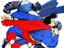
Doug: I guess I have mixed emotions about what Frank Miller did to not only Batman, but ultimately to the comic industry as a whole. Prior to Miller’s “darkening” of the Batman mythos, the best run of stories was the O’Neil/Adams collaboration in the early 1970’s. Those stories had taken Batman back to his roots, and created a moody, dangerous Gotham . But it was a Gotham still within the bounds of a conventional DC Universe. Frank Miller broke many rules of the industry, adding elements of coarse language, prostitution, and death. I really feel that what befell Robin II (Jason Todd) was directly tied to the “prophecy” in the pages of The Dark Knight Returns. But, I fully enjoyed The Dark Knight; it was the first book that I could recall at the time when I could hardly stand the wait until the next issue. And maybe it’s because it was groundbreaking stuff, that was more or less continued in Miller’s follow-up effort, Batman: Year One. So, outside of the aforementioned O’Neil/Adams books, I guess I’d say Frank Miller changed Batman for the better. It’s not his fault that he also ushered in the age of the mini-series, with endless gimmick stories that could formerly have been told in the continuity of the regular titles. Along with the mini-series also came the upscale-format books.

Karen: Like most people my age, my first exposure to Batman was through the Adam West TV series. After that, it was the Batman cartoons Filmation put out in the 70s. I really didn’t read Batman in comics much (other than his appearances in Justice League of America) until Frank Miller showed up and smacked everyone in the head with Dark Knight. At the time, it was revolutionary, but I now feel like it has unfortunately led to the concept of Batman being one step from insanity, which I think is a gross mischaracterization. (The Killing Joke didn’t help, either.) Because of this idea, he became an almost unlikeable character in the comics in the early years of this decade. I think there’s been an effort to make him less of a bastard since the publication of Identity Crisis, but I’m not sure how successful that’s been.

My favorite incarnation of Batman is actually the cartoon version, from Batman: the Animated Series and Justice League and Justice League Unlimited. The writers of those shows seemed to “get” Batman: smart, cool, always prepared for any situation. I really like stories that highlight Batman’s intelligence and grit over his physical abilities. And of course, Kevin Conroy has a fantastic voice as Batman!


Sharon: The Batman of the 1960s. Not necessarily the sunny, camp version on TV a la Adam West, but more like the Batman during the time of Adams, Aparo, and Rogers...a decidely less neurotic, disturbed character than the Miller and subsequent versions. My Batman is a relatively healthy, "normal" person, not as a psychologically scarred avenger. 

Who ya got? Joker, Penguin, Riddler, or Catwoman?

Doug: Of the four choices, I prefer the Joker or Catwoman. The Penguin doesn’t do much for me – never has. I know they tried to re-energize him about a decade ago, almost turning him into a Kingpin-like character. Bleh… The Riddler can be fun; one thing I always appreciate about Riddler stories is the time it must take the creators to think up the riddles that are set up to stump Batman yet help him solve the crime.

The Joker these days has to be taken seriously. That doesn’t necessarily mean there has to be a large body count, or really graphically-violent writing. A writer who can inject the psychological thrill of the chase, or the dichotomy of the Batman/Joker personality conflict tends to be the most successful storyteller. Any writer who can put on the printed page what Heath Ledger brought to the silver screen is on the right path…

Catwoman works best for me when she is a thief, wanting to reform but not quite able to be good. This, coupled with the sexual tension between she and Batman, makes for a good read.

Karen: To be honest, I’ve never really been that interested in any of his villains. I always thought the Penguin and Riddler were fairly lame. While the Joker makes a great nemesis for Batman, my lifelong phobia of clowns makes it difficult for me to enjoy stories featuring him! I do like the aspect of Catwoman being a love interest/rehabilitation project for Batman. I really wish that DC had not wiped away the multiple earths years ago, because I like the idea of Bruce and Selina eventually marrying, and having Helena. Although who knows, this may all be coming back soon!

Sharon: Riddle me this: who's lithe and green and covered with question marks? That's right, Frank Gorshin. I was in lust with him before I knew what lust was. So he is my sentimental favorite for Batman villain.

But I realize that the Riddler was a very minor Batman villain until the TV show; and so, my crush notwithstanding, I'd have to give Catwoman the high marks here as an enduring foe and an indelible part of the Batman saga. The Joker has morphed inot something not quite human.

Who’s your favorite Joker? 

Doug: Of all the incarnations of the Joker (speaking of film), my favorite is Mark Hamill’s version on Batman: The Animated Series. I thought Paul Dini and others did a great job on characterization, the voice acting was top-notch, and the stories were interesting. Carrying over to the comics, the one-shot Mad Love by Dini and Bruce Timm was a great, edgy book.

Karen: Again, my clown phobia sort of hinders me here. Last year I read the Steve Englehart/ Marshall Rogers Batman stories, some of which featured the Joker, and I thought their Joker had the right balance of nonsensical behavior coupled with menace. I never cared for Jack Nicholson’s Joker; I could never see the character, only the actor. On the other hand, I thought Heath Ledger gave a very convincing, and disturbing, performance in The Dark Knight.

Sharon: Cesar Romero- -no surprise, right? Even if he refused to shave his mustache (they painted the Joker's white make-up right over it). I never liked Nicholson's Joker either.

Of the many looks for Catwoman, which is your favorite?

Doug: My favorite look for Selina is the long purple dress, trimmed in green. I especially liked the way Alan Davis drew her in the pages of Detective Comics, right before the Batman: Year Two arc (circa 1989).

Karen: As a child of the late 60s/70s, my most primal impression of Catwoman comes almost entirely from Julie Newmar’s portrayal on the Batman TV show. So I guess I vote for the skintight, sexy black suit.

Sharon: I loved the green, sequinned catsuit she wore in Batman #197, when she fought Batgirl (largely because she thought Babs was romantically interested in Batman). That green costume was a departure from her usual dark purple long-skirted costumes. I thought it was very flattering, much better than the usual purple--I really liked the contrast of the green with Selina's black hair. The sleek catsuit was most likely inspired by Newmar's costume on TV.

Batman 197-Catwoman Batgirl

With or without Robin?

Doug: I guess without – unless it’s a young and inexperienced Robin. That adds tension to the story and increases the psychological push/pull on Batman’s insecurity as to whether or not he should have a partner.

Karen: Intellectually, I would have to go with the “no Robin” option. It makes no sense for Batman to be putting some kid in harm’s way. And yet…I have a very sentimental spot in my heart for Robin. Besides the sheer goofiness of the pairing, having Robin around also helps to humanize Batman. And on top it all, I like the development and growth of the relationship between Bruce and Dick (more on that below).

Sharon: The pairing really makes no sense when you think about it- -why would Bruce want to jeopardize a youngster's life? Why would Batman even need a partner?- -but I agree with Karen, such a partnership does serve to humanize Batman.

Which Robin??

Doug: Dick Grayson. No doubt. I never liked Jason Todd (not that I agree with his fate back in the late ‘80’s), and find Carrie Kelly of the Elseworlds Dark Knight tales to be just an odd situation. Tim Drake is perhaps the most well-developed character of the entire lot, and has now worn the mantle about half as long as Grayson did. But my childhood memories are of Dick Grayson, and even today I still see Nightwing as Robin.

Karen: I am also a Dick Grayson fan. I think the growth of the relationship between Bruce and Dick has been very interesting. It is not a nice, neat, clean relationship. They have issues. Dick was deeply hurt when Bruce selected Azrael instead of himself to fill in as Batman. But Dick has gone off and become his own man. They have very different personalities and strengths. I would say that Dick has become a very good leader, something I don’t think Bruce ever really has been.
As for the other Robins, I never warmed up to Jason Todd. I do like Tim Drake – of all the Robins, he seems closest to Bruce in personality. I think he’s done well as Robin.

Sharon: Dick Grayson by a mile. As Karen said, unlike Batman he was a born leader, something that evident as far back as the 1960s Teen Titans. I could never quite believe the confident, smart as a whip, take charge guy in TT was the same silly, sometimes obtuse kid appearing in Batman and Detective. 

And to me, Nightwing will always be Superman flanked of course by Jimmy Olsen as Flamebird. Well, I don't blame Dick for borrowing the name--I always thought Nightwing and Flamebird were much cooler names than Batman and Robin!

In the Justice League or the Outsiders, or solo?

Doug: I really prefer Batman solo. However, if he’s in a team book, he needs to be written correctly. The Paul Dini/Alex Ross JLA collaboration in the oversized series of a few years ago featured a Batman in the shadows, mistrustful of his teammates, and going off on his own to solve the problem at hand. That is how I would see him. The mentor role that he filled in Batman and the Outsiders – that’s just not how it is for me. He’s just not a group kind of guy. However, I would say that I did really enjoy the Giffen/DeMatteis/Maguire Justice League series of the post-Crisis era. But, that was meant to be tongue-in-cheek, so it worked.

Karen: Again, this is another area where, intellectually, it seems wrong for this quintessential loner to be on a team. And yet, as a fan of teams, I like seeing how he interacts with others. Going back to the Justice League cartoon, I think they did a great job showing how Batman still had to operate on his own terms while a member of a team. I loved the episode where the rest of the League has decided to turn themselves in to the government to quell fears. When they contact Batman and tell him, he says something along the lines of, “That’s the stupidest plan I’ve ever heard.” He decides to work on the problem on his own. After he hangs up, Wonder Woman says, “That went better than expected.”

Sharon: I just cannot get used to this anti-social, arrogant, above it all Batman (though I guess it's his been accepted portrayal for years now). I mean, this was a guy who--in his Batman guise--was hitting on Black Canary in the late 60s. Who palled around with Supes in World's Finest and a variety of other heros in The Brave and the Bold. Okay, I'm talking about the Stone Age--er, the Silver Age, and I know it's been decades since he was Mr. Nice Guy, but in my mind eye's, he's no recluse or snob. I don't see him as someone who goes off on his own to solve crimes or is aloof, as in Identity Crisis. 
What’s your opinion on Batman’s extended family – Batgirl (Barbara Gordon), Bat-Mite, Batwoman, Batgirl (original), and/or Ace the Bat-hound?

Doug: Leave it. If I had to keep one, it would be Barbara Gordon. I also recall the first Batgirl being in the Teen Titans West for a very short time – not long enough to catch on.

Karen: I don’t have a lot of knowledge or interest in those characters except for the original Batgirl, Barbara Gordon. I’ve always liked her, and I absolutely hated what happened to her in The Killing Joke. But I like the fact that she is a detective, and continues to use her brainpower to help Batman and others.

Sharon: Schwartz's Batgirl (Babs) is the only one of lasting value; a really interesting character for the 1960s, never a damsel in distress or someone's girlfriend, her chief strength was her intelligence--and it continues to be, as Oracle.

The others mentioned--Batwoman, Bat-Mite, et al.--were an attempt to copy the successful Superman supporting cast formula (Robert Kanigher also followed suit and installed a similar sort of cast for Wonder Woman). When Julius Schwartz took over as Batman's editor, he summarily dismissed Batwoman, Bat-Girl (note the use of the hyphen; why not "Batgirl", to be consistent with Batwoman and Batman?), Ace and Bat-Mite (who was Bats' answer to Mr. Mxyptlk). Despite his "banishment", Bat-Mite made an appearance (along with Mxyptlk) in World's Finest #169, the debut of the Supergirl-Batgirl team.

How important is Alfred?


Doug: Alfred is, in my opinion, more important to Batman than any other character in the supporting cast. And particularly as he’s been portrayed recently – as caregiver, medic, partner in crime-fighting. 

Karen: Alfred feels like an essential part of the Batman mythos to me. Although largely devoid of a life of his own, he serves as a good sounding board and aide to Batman. I also like seeing a more capable Alfred, not just an upper crust butler but someone with a bit of an edge to him. I like how Michael Caine played him in the latest movies – you know this guy has some depth to him.

Sharon: Loved Alan Napier. Did you know he was 6'6"? He added just the right gravitas to the character. In the comics Alfred was killed off in the 1960s but DC had to revive him because he was in the TV show.

Gadgets/technology, or just hard-boiled detective?

Doug: While some of the gadgets are cool, I prefer Batman as the Dark Knight Detective – using his wits and skills to solve crimes and mete out justice.

Karen: I admire Batman’s keen intelligence and perception – he’s always two steps ahead of everyone else in the room. If you looked at the Justice League as greek heroes, Batman would definitely be the Odysseus of the group – the man with the plan. He’s the one guy you can’t stop – you can use kryptonite on Superman, or take away Green Lantern’s ring; but Batman’s power is his mind and unstoppable will. You can’t take that away unless you kill the man.

Sharon: Well, that explains the casting of Clooney (Batman and Robin) as a latter-day Odysseus in O, Brother, Where Art Thou?

Anyway...intelligence and deduction over gadgets any day. As mentioned, "smarts" were really Batgirl's stock in trade in the 60s, she relied on her wits (and a photographic memory) to deal with criminals, while Batman still had his handy-dandy utility belt and the perfect weapon for every occasion. Slowly but surely, Schwartz phased out the reliance upon the gadgets.
Related Posts Plugin for WordPress, Blogger...